Black Human Interaction Icons Set: Enhancing Visual Communication in Design Workflows
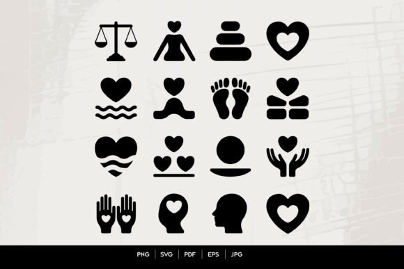
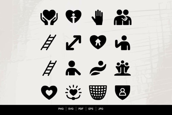
Visual communication plays a critical role in digital design, especially when conveying concepts like collaboration, trust, and support. The Black Human Interaction Icons Set offers a comprehensive collection of icons that represent a wide range of human interactions. From teamwork and care to safety and growth, these icons provide a consistent and minimal visual language for designers, developers, and content creators.
Whether you're designing a website, mobile app, or marketing material, using a well-structured icon set like this helps streamline your workflow and improves the clarity of your message. The Black Human Interaction Icons Set includes SVG, PNG, EPS, PDF, and JPG formats, making it compatible with a variety of tools and platforms. This flexibility ensures that the icons can be integrated seamlessly into different stages of a project, from initial planning to final deployment.
Using the Icon Set in Different Stages of a Project
Icons are not just decorative elements—they serve functional purposes throughout the design and development lifecycle. Here's how the Black Human Interaction Icons Set can be applied across different phases:
- Before a project begins: Use icons to visualize concepts and brainstorm ideas. For example, the family icon or group icon can represent community features in a new app, while the ladder icon might symbolize progression or onboarding.
- During development: Incorporate icons into UI mockups, wireframes, and prototypes. The minimal and monochrome style of this set ensures that they blend well with flat and modern design systems without overwhelming the interface.
- After launch: Icons help users navigate content and understand features more efficiently. A heart hands icon can represent a support or donation feature, while a stop hand icon may indicate a pause or cancel action.
Integration with Design Tools and Platforms
The versatility of the Black Human Interaction Icons Set lies in its compatibility with a wide array of design and development tools. Whether you're working in Figma, Adobe XD, Sketch, or directly in code, these icons can be used with ease. The availability of vector formats like SVG and EPS ensures scalability without loss of quality, which is crucial for responsive design and high-resolution displays.
For developers, SVG icons can be embedded directly into HTML or styled using CSS, enabling dynamic color changes and animations. Designers working in print or presentation formats can benefit from the PDF and JPG versions, which maintain clarity across different output sizes.
Practical Workflow Examples
Here are a few real-world scenarios where the Black Human Interaction Icons Set can enhance visual communication and improve user experience:
- Educational Platforms: Use the growth icon or progress icon to represent learning milestones. The ladder icon can illustrate a step-by-step learning path, while the direction icon can guide users through course modules.
- Community Websites: The trust icon or hand gesture icon can reinforce a sense of security and collaboration. Group and family icons are ideal for representing community features or family plans in membership-based services.
- Support and Social Care Applications: Icons like love care, helping hands, and protection icon are especially useful in apps related to mental health, caregiving, or social services. These symbols provide a visual shorthand for users navigating sensitive content.
- Business Dashboards: Use the user icon, group icon, or team icon to represent different user roles or analytics categories. The arrow icon and direction icon help illustrate trends and movement within data visualizations.
Design Consistency and Long-Term Usability
One of the most important aspects of using any icon set is maintaining visual consistency across your project. The Black Human Interaction Icons Set follows a unified style—minimal, flat, and monochrome—making it easier to maintain coherence throughout your design system. This consistency contributes to better user recognition and a more polished final product.
When integrating these icons into long-term projects, consider creating a centralized icon library within your design tool or codebase. This approach ensures that all team members are using the same assets and reduces the risk of version mismatches or style inconsistencies. It's also helpful to document how each icon is used within your interface to maintain clarity and avoid confusion over time.
Optimizing for Efficiency and Accessibility
Efficiency in design doesn't just come from choosing the right icons—it also involves how you organize and implement them. The Black Human Interaction Icons Set supports this by offering multiple file formats and a clear visual hierarchy. To make the most of this set, consider the following tips:
- Organize icons by category: Group icons by function (e.g., social, care, progress) to speed up the design process and improve asset management.
- Use naming conventions: Whether in your file system or within your design tool, consistent naming makes it easier to locate and reuse icons.
- Optimize for performance: When using SVGs on the web, ensure they are properly optimized to reduce file size and improve page load times.
- Ensure accessibility: Always pair icons with text or provide appropriate alt text when used in digital interfaces, especially for users relying on screen readers.
Conclusion: A Valuable Asset for Visual Storytelling
The Black Human Interaction Icons Set is more than just a collection of graphics—it's a tool for visual storytelling and effective communication. Whether you're a UX designer, developer, marketer, or educator, this icon set supports a wide range of use cases across different platforms and workflows. Its minimal, scalable design ensures that it can adapt to both current and future design trends, making it a long-term asset in your creative toolkit.
By integrating this set into your process thoughtfully, you can enhance the clarity of your message, streamline your workflow, and create more engaging user experiences. As with any design resource, the key is to use it with intention, ensuring that each icon serves a clear purpose and contributes to the overall goal of your project.